 Here is a closer look at my 'personal pallette'. This idea was inspired by Linda Woods and Karen Dinino's 'Visual Chronicles' and 'Journal Revolution'. I took 2 ideas and made them one. The basic premise is to attach certain emotions or situations to particular fonts. Likewise, you decide which colors represent which people, emotions, and situations to you. For example: Oranges and yellows along with KirstenITC font=vibrant, happy, excited, gleeful. I had a fun day using up paper scraps to make this. I often reach for it when I scrapbook.
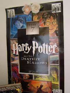
Ok, these two items below just show my inner geek. They make me happy. Happy=inspired(no matter by what). Besides, the HP poster(uber-fan) has a lot of cool color; so do the Cubeworld people. I hope you all had a great holiday. I'm off to a baseball game and fireworks tonight.


No comments:
Post a Comment